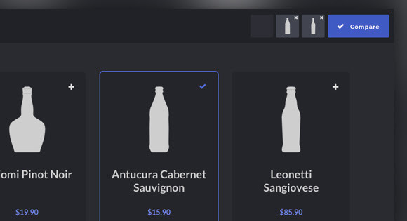
<span style="color:rgb(0, 0, 0); font-family:arial,helvetica,sans-serif; font-size:14px">This Blueprint is a responsive product grid layout with comparison functionality. A maximum of three items can be selected for the product comparison. The comparison view shows flexbox-powered columns or rows (depending on the viewport size) that appear with a slide-in effect. There are a couple of example media queries for smaller viewports.</span>